
A Factual Look at Obama’s Presidency
By James D. Agresti
January 11, 2017
Correction appended
In the closing weeks of his presidency, Barack Obama instructed the members of his cabinet to “prepare a detailed report on the progress we’ve made” since he became president. He then summarized these reports in a cover letter that paints a bleak picture of the U.S. before he entered the Oval Office and suggests that the nation turned around during his tenure.
Obama then repeated many points from this letter in his January 10th farewell address to the nation, where he declared that “by almost every measure, America is a better, stronger place than it was when we started.”
However, the claims in his letter and farewell address are based on a series of artful statistics that do more to mislead than inform.
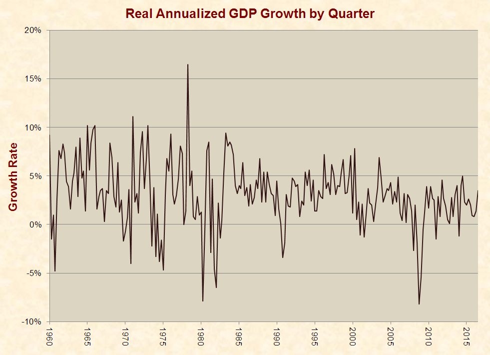
For example, Obama contends that “on January 20, 2009,” when “I stood before you and swore a sacred oath” to “meet the challenges we faced,” the economy was “shrinking at more than eight percent,” but now “eight years later” it is “growing at more than three percent.”
In reality, that –8% figure is a quarterly annualized rate from October–December of 2008, and the +3% figure is from July–September of 2016. Quarterly GDP figures are often erratic, and this makes it easy to cherry pick in order to serve a narrative, as shown in the graph below:
 Looking at the full picture, the economy has experienced historically weak growth under Obama. Even after the recession ended in 2009, average real GDP growth has been 35% below the average from 1960–2009, a period that includes eight recessions. Annual GDP data, which removes the noise from quarterly fluctuations, shows substandard growth over the entirety of Obama’s presidency:
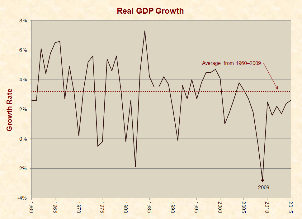 Such poor growth is odd given that the U.S. economy typically performs well in the wake of recessions, and the deeper the recession, the stronger the growth. In fact, renowned liberal economist Paul Krugman once argued that “the economic expansion under President Reagan did not validate his economic doctrine,” because “rapid growth is normal when an economy is bouncing back from a deep slump.”
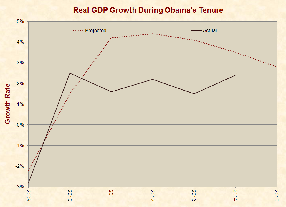
In early 2011, the White House Office of Management & Budget projected that real GDP would grow by an average of 3.6% per year for five years after the Great Recession (see pages 14–16). Obama’s economists noted that this figure was lower than the typical post-recession growth rate of 4.2%, but they concluded that the “lingering effects from the credit crisis may limit the pace of the recovery,” even though the recession left “enormous room for growth in 2011.” Ultimately, GDP grew by an average of 2.2%, or 39% below the White House’s conservative estimate.
Likewise, two weeks before Obama took office, the Congressional Budget Office (CBO) projected real GDP growth rates for upcoming years “under an assumption that current laws and policies regarding federal spending and taxation remain the same.” This graph shows CBO’s projections and what actually occurred:
 In 2016, Obama took credit for “saving the world economy from a Great Depression,” but the recession ended in the U.S. in June 2009, or five months after he took office and well before the vast majority of his “stimulus” bill took effect (see page 2).
Along with economic growth, Obama’s missive provides other creative looks at his presidency, including this chart of high school graduation rates that is scaled to exaggerate the improvement:
 America Under Obama
The upcoming 16 graphs present federal government data on certain key measures of America’s well-being during Obama’s presidency. The following features and caveats apply to these graphs/datasets and those above:
- To provide context and reveal trends, the graphs present all available full years of data back to 1960 or as far back in time as the datasets extend. All graphs are scaled from a baseline of zero or any negative figures.
- As explained in The Secrets of Economic Indicators, a textbook published by the Wharton School and Pearson Education, “The first release of many economic indicators contains pieces of data that are far from reliable and thus considered preliminary.” Hence, some of the more recent data may change over time.
- The graphs contain data on big picture outcomes with tangible impacts. Obama’s cover letter mentions variables like the portion of people with health insurance, but this is of little import if the insurance does not provide access to good medical care.
- None of the parameters graphed in these charts are an end-all, and each sheds limited light on very complex issues.
- A marker is placed on each graph in the year 2009, which was Obama’s first year in office. This provides a one-year buffer for Obama’s policies to begin taking effect, although some took longer and some shorter.
- CBO’s January 2009 projections are provided when applicable, and averages are provided when the data tends to oscillate over time.
It is also important to note that presidents cannot reasonably take credit or blame for everything that occurs during their tenures. Due to the limits of political power and the U.S. constitutional system of checks and balances, each president’s hands are tied to varying degrees by Congress, the courts, preexisting laws, state and local governments, economic cycles, demographic trends, terrorist attacks, natural disasters, and the actions of U.S. citizens and foreign governments.
On the other hand, U.S. presidents have vast executive powers, and President Obama and the Democratic Party possessed more legislative power in 2009–2010 than any caucus in recent history. During this period, Obama enjoyed a 79-seat Democratic majority in the House and an effective 18- to 20-seat majority in the Senate. Obama’s House majority was greater than that of any president since Bill Clinton in 1993–1994, and Obama’s Senate majority was greater than that of any president since Jimmy Carter in 1977–1980.
After Republicans gained control of the House in 2011 and the Senate in 2015, they sometimes prevented Obama from having his way, but they generally failed to undo what he previously passed, stop Obama’s executive actions, or pass any laws without his consent. Over the past eight years, Obama has vetoed 12 bills, and Congress has overridden only one of these vetoes.
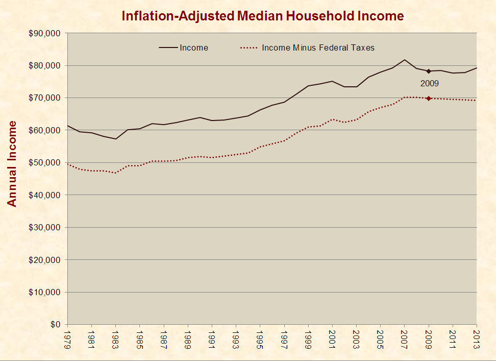
Median Household Income
Between 2009 and 2013 (latest available data), real median household income rose from $78,200 to $79,200. During the same period, real median household income after federal taxes declined from $69,800 to $69,200:
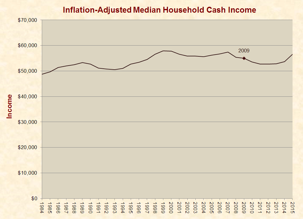
 Between 2009 and 2015, real household cash income (which excludes “certain money receipts such as capital gains” and “the value of noncash benefits” like “food stamps, health benefits, subsidized housing” and “full or partial payments by business for retirement programs”) rose from $54,988 to $56,516.
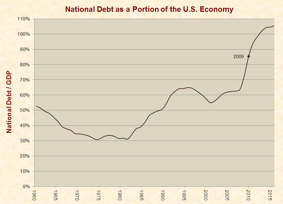
 National Debt
Between 2009 and 2015 the national debt rose from 85% of the U.S. economy to 105%:
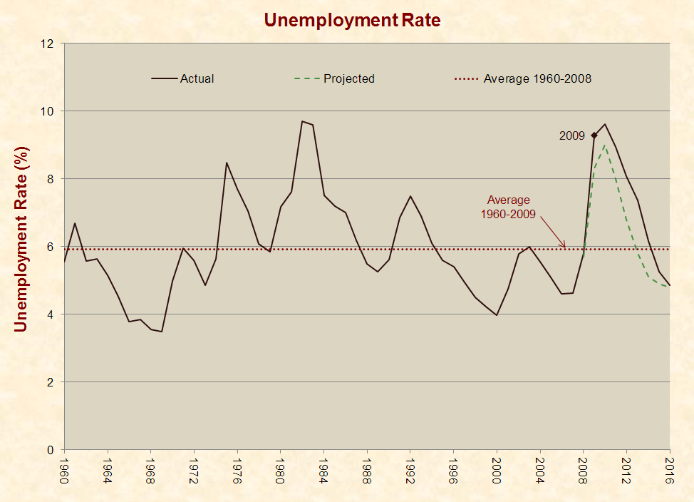
 Unemployment
Between 2009 and 2016, the unemployment rate dropped from 9.3% to 4.9%. During each of these years, the unemployment rate was higher than the Congressional Budget Office projected two weeks before Obama took office:
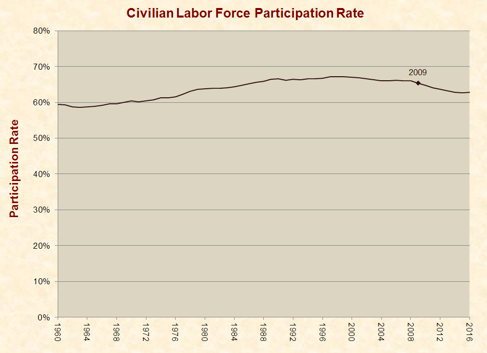
 Labor Participation
Between 2009 and 2016, the civilian labor force participation rate for people aged 16 years and over declined from 65.4% to 62.8%:
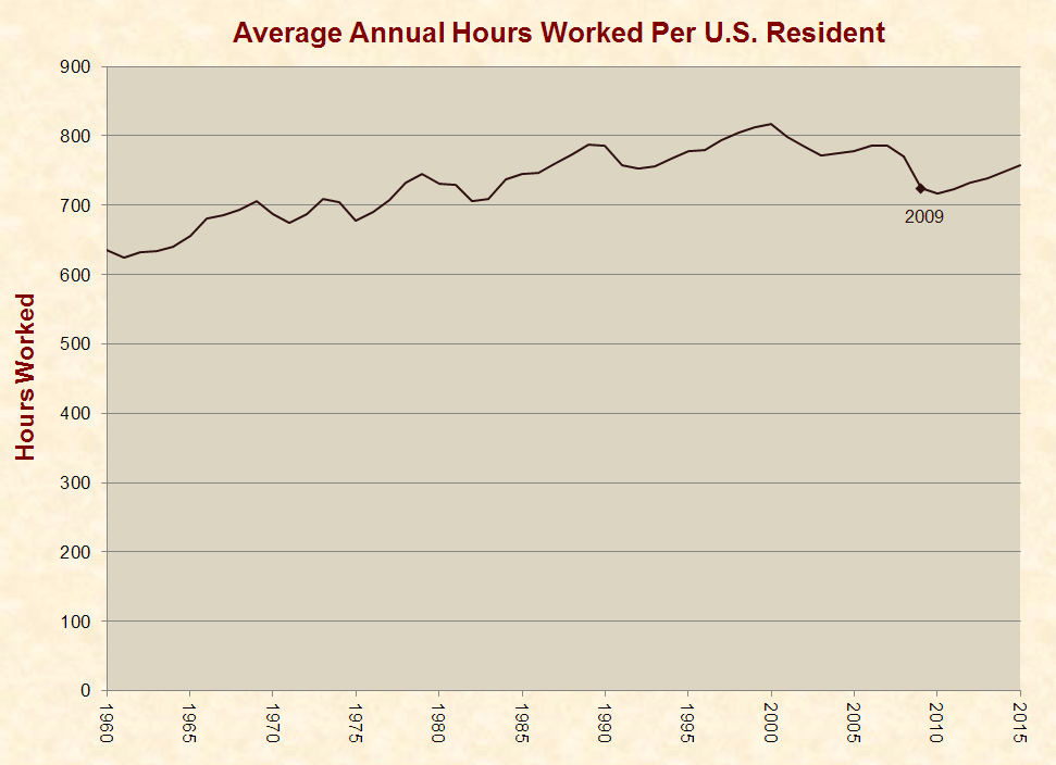
 Work Hours
Between 2009 and 2015, the average annual hours worked per U.S. resident increased from 724 to 757:
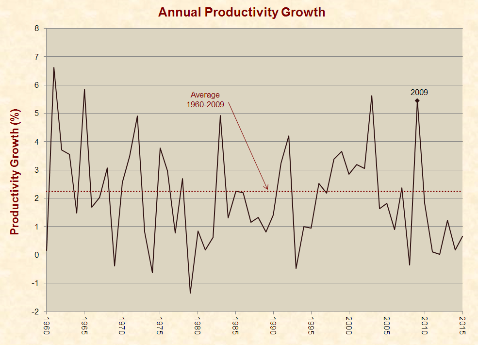
 Productivity
In the words of Federal Reserve Chair Janet Yellen, “the most important factor determining living standards is productivity growth.” From 2010–2015, average annual productivity growth was 0.7%, as compared to 2.2% from 1960–2009:
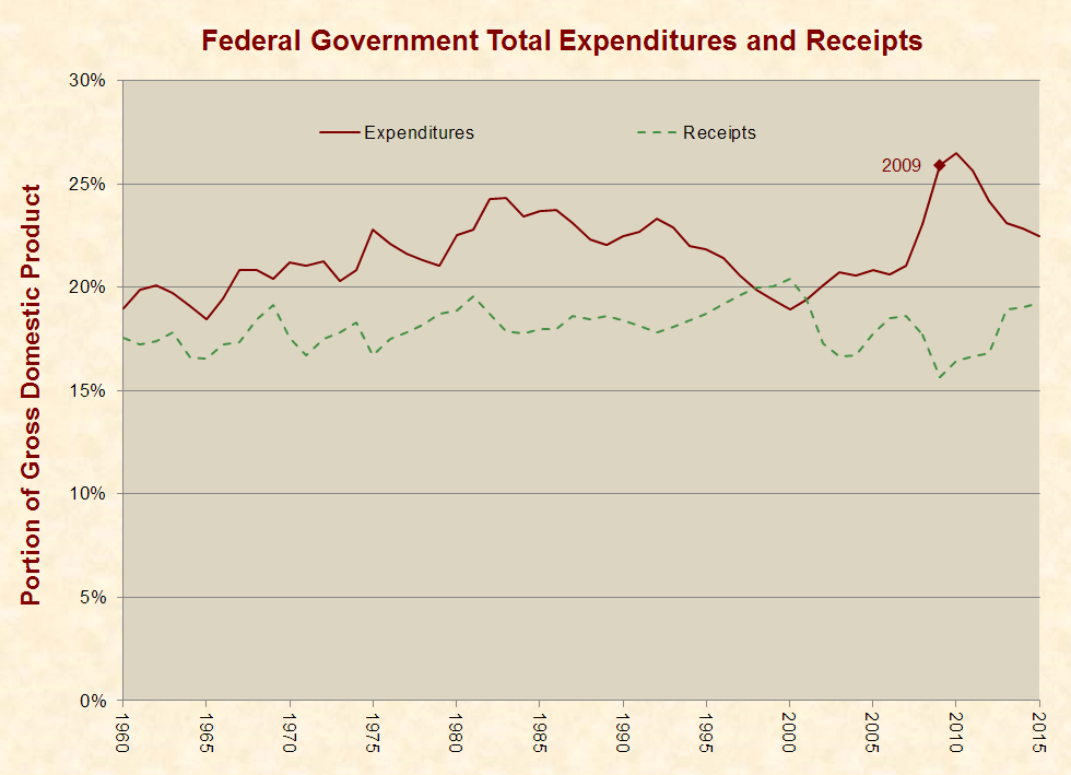
 Federal Taxes and Spending
Between 2009 and 2015, federal spending decreased from 25.9% of the U.S. economy to 22.5%. During the same period federal revenues increased from 15.7% to 19.3%:
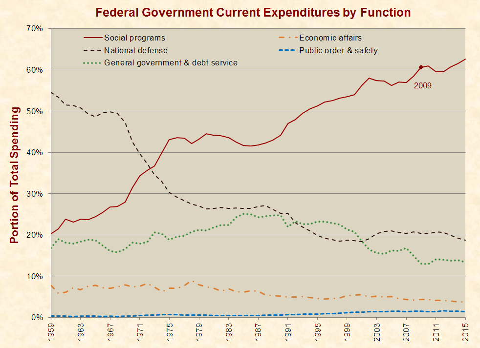
 Composition of Federal Spending
Between 2009 and 2015, the portion of federal spending devoted to social programs increased from 61% to 63%. During the same period, the portion devoted to national defense and veterans’ benefits decreased from 20% to 19%:
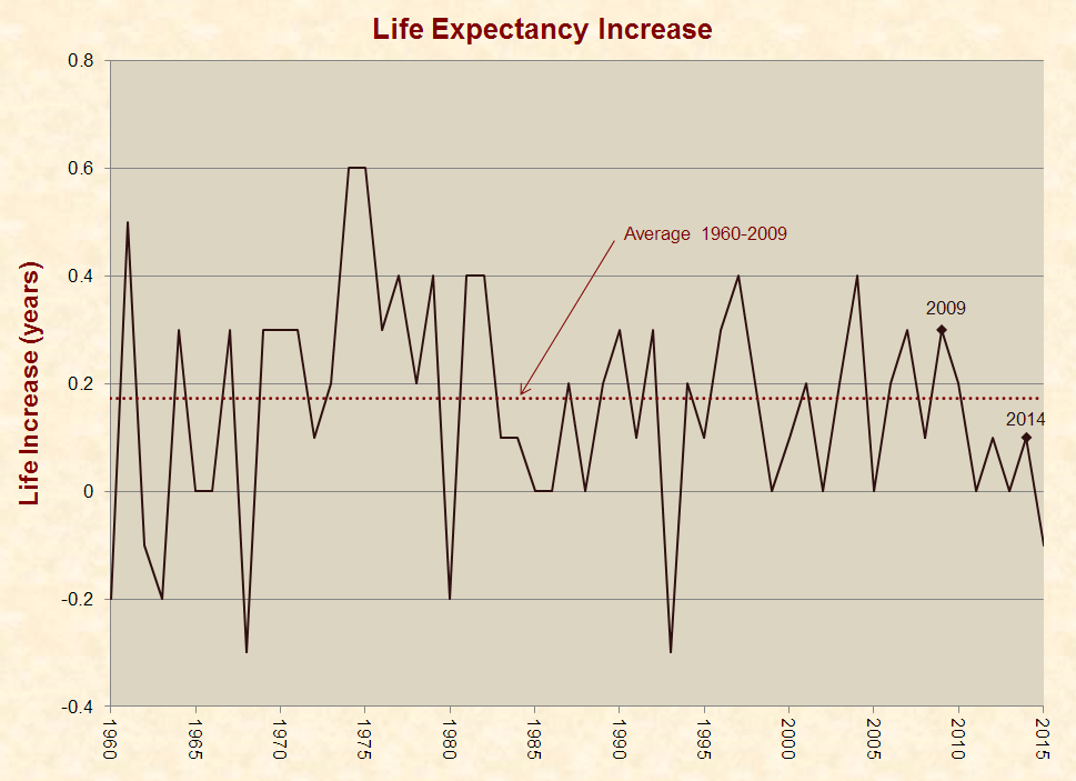
 Life Expectancy
From 2010–2015, the average annual life expectancy increase was 0.05 years, as compared to 0.17 years from 1960–2009. The following graph also contains a marker on 2014, because this is when most major provisions of Obamacare became operative, including the Medicaid expansion, rule on preexisting conditions, fine for not having insurance, and the subsidized “marketplace” health insurance plans:
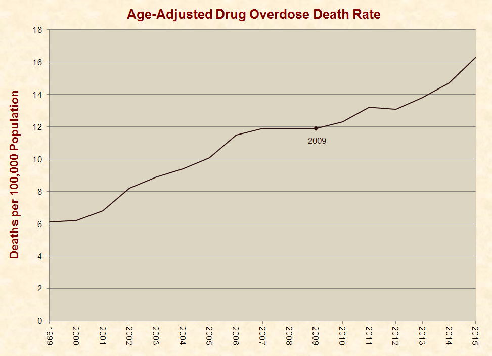
 Drug Overdose Deaths
Between 2009 and 2015, the age-adjusted drug overdose death rate increased from 11.9 per 100,000 people to 16.3:
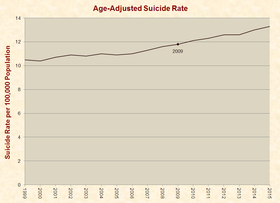
 Suicides
Between 2009 and 2015, the age-adjusted suicide rate increased from 11.8 per 100,000 people to 13.3:
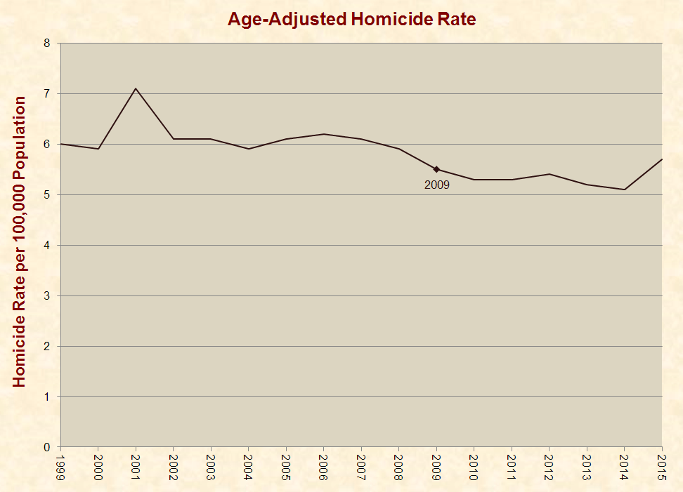
 Homicides
Between 2009 and 2015, the age-adjusted homicide rate increased from 5.5 per 100,000 people to 5.7:
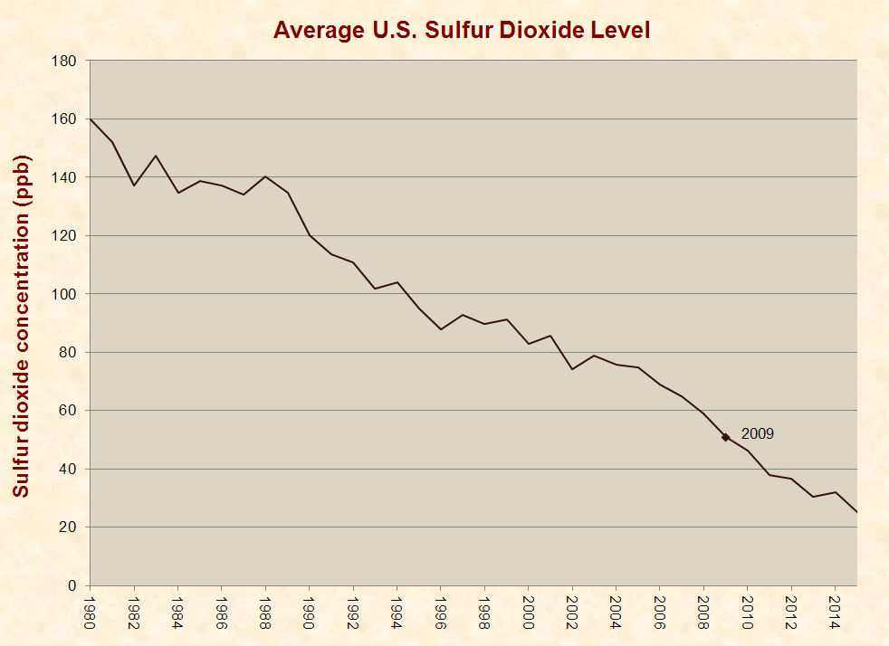
 Sulfur Dioxide
Sulfur dioxide is a common pollutant and highly reactive gas that can cause respiration problems. Between 2009 and 2015, the average sulfur dioxide level in ground-level air declined from 51 parts per billion to 25:
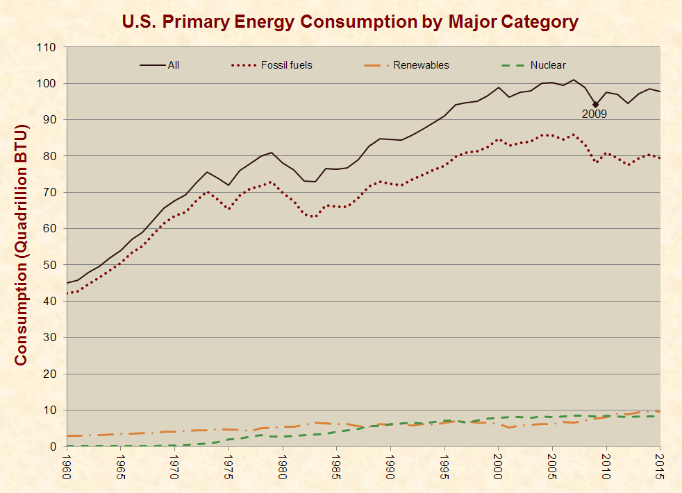
 Energy Use & Composition
A particularly misleading aspect of Obama’s farewell address is the following statement, which he led up to by railing against the “selective sorting of the facts” and declaring that “science and reason matter”:
Take the challenge of climate change. In just eight years, we’ve halved our dependence on foreign oil; we’ve doubled our renewable energy; we’ve led the world to an agreement that has the promise to save this planet.
Actually, renewable energy increased by 27% between 2009 and 2015, which is nowhere close to doubling. Obama’s statistic may be rooted in a crafty definition of renewable energy that excludes major sources like hydropower.
Furthermore, Obama’s words leave the distinct impression that the U.S. has cut oil consumption by replacing it with renewables. Yet, U.S. petroleum consumption rose from 6.6 billion barrels in 2009 to 6.7 in 2015.
The primary reason oil imports have fallen is that domestic production has risen due to the use of hydraulic fracturing or fracking, which is unpopular with many environmentalists. Per the U.S. Energy Information Administration, fracking has “allowed the United States to increase its oil production faster than at any time in its history,” and it now produces “about half of total U.S. crude oil production.”
Looking objectively at the issue of energy, between 2009 and 2015, U.S. energy consumption rose from 94 quadrillion BTUs to 98. During the same period, consumption of fossil fuels increased from 78 to 79, nuclear stayed level at 9, and renewables increased from 8 to 10:
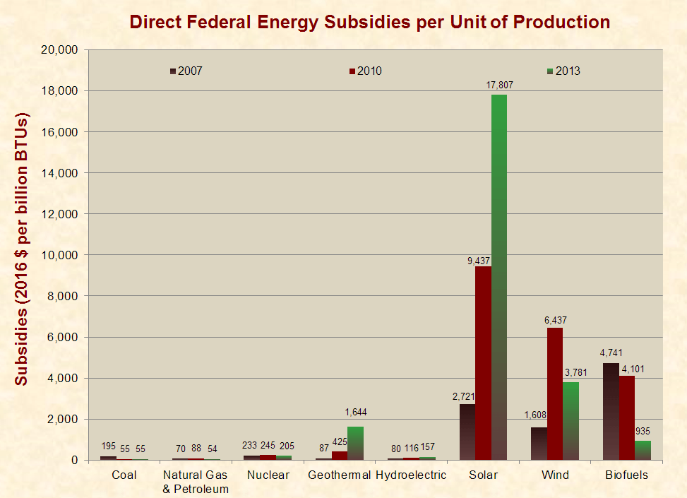
 Energy Subsidies
Between 2007 and 2013, inflation-adjusted direct federal energy subsidies per unit of production of solar energy increased from $2,721 per billion BTUs to $17,807. For other energy sources, subsidies varied as follows:
 Corrections:
- 1/18/17: The original version of this article incorrectly identified the period of –8% GDP growth as April–June of 2009.
- 1/24/17: The original version of this article incorrectly stated that the median household income in 2013 was $79,000, while it was actually $79,200.


It will take me time to digest all the information! Great article!
The labor statistics don’t follow the reality that much of the work force is in part- time jobs and the uncounted unemployed and not looking for work aren’t represented here.
Not true. The chart of labor force participation accounts for people who are not looking for work, and the chart of hours worked per U.S. resident accounts for people who have part-time jobs.
Jum, no U3 the officially posted measure since Bush 41 does not take what you say into account. U6 is the measure that takes what you say into account. It is hovering at near 9% still.
Please read what I wrote. I was not referring to the unemployment rate (U3) but to the “labor force participation rate.” This accounts for people who are not looking for work and provides a broader measure of labor inactivity than U6 (otherwise known as “underemployment.”)
Good article, but it really needs citations 🙁
Click on the links. This article is thoroughly documented, like all of Just Facts’ work. See our Standards of Credibility.
citations are in the links they input in every paragraph
Though mentioning the Lefts obvious control his first 2 yrs, and then the flip in the House and later Senate, where are the analytics that would take sequestration into effect. And your conclusion, is thr State of the Union in a better place than 8 years ago?
Why are you asking for opinions on a fact site?
It is refreshing to have just the facts in one place. Thanks!
AMEN!
A lot of data to digest especially grateful for the links to the citations.
Will enjoy sharing and discussing. But will leave conclusions to the Historians in a few years or when his documents are released.
Have already shared with friends along with recommending your website!
That’s all well and good as a person who looks at what’s going on in his little world this is what I see people who have worked paid there taxes and now due government created problems can not refinance their homes due to a disability even thought they have excellent credit scores but no job. Never late on payments car mortgage credit cards nothing but no job no refinance
Great read.
So, from your own information, basically, yes, we are better off today than in 2009, but not as much as projected by the CBO. As the CBO really did not factor in a severe bank contraction, the projections are rather meaningless. That was not a typical recession. It was a depression and recovery from those things is very different than that of a business recession.
Your claim that CBO did not factor in a severe bank contraction is false. Again, the CBO report was published in January 2009. This was after the vast majority of bank failures and contractions, and the CBO report contains extensive analysis of the banking crisis: https://www.cbo.gov/sites/default/files/111th-congress-2009-2010/reports/01-07-outlook.pdf
Furthermore, the economy performed significantly worse than the White House projected in 2011, well after the recession had ended.
Moreover, a number of charts in the article indicate that we are not better off today than in 2009.
Great article.
I love how you criticize cherry picking statistics by cherry picking statistics. Just the Facts, Ma’am.
What a joke. You also don’t address the fact that over powered growth is what lead to the recession, world wide. Our goal shouldn’t be China, unless you like your fellow American groveling for their last dollar.
The biggest issue in the current economy is wages and the death of the middle class. There have been some peeks of growth in this area nothing substantial. Ironically, nothing being proposed would do anything to change this. College educated salaries on the rise. Skilled labor is stagnant. So we bring back manufacturing and pay people 1970s wages? What a genius plan. These people already work at those rates, they are just going to have to pay more for their stuff. Middle class continues to fall to the margins while college degree wages continue to rise.
Now, the real kicker is that if you are truly looking at this from an economics point of view, then you know the President has little effect on actual economic trends. Obama is dumb for saying it and you are dumber for wasting time arguing it. It is quite possibly the largest waste of time I’ve read today.
Thank
And yet you wasted more of your time criticizing it. These are facts presented for you to draw your own conclusions, which you evidently had done before you read it.
The fallacy in your argument is that the President has little effect on actual economic trends. Historically, this may be so but in Obama’s case, through his own executive orders and by regulations imposed by multiple agencies such as the EPA and the Bureau of Land Management, he has certainly had a deleterious effect on the growth of the economy and the GDP.
You are right that the middle class is shrinking. But do you know where they went? Into the upper classes.
You may go to table F-23 from the U.S. Government census historical income tables. There you will see that adjusted to 2013 dollars those earning less than $15,000 was 7.9% of the population in 1971 and 8.0 % of the population in 2013. $15,000 – $24,900 income range stayed around 8-9% (actually went down!), the same for the next two income classes up to $49,900 NO CHANGE or A DECREASE of those in the income class! yea, the poor are not getting poorer. even after the $3 trillion “war on Poverty”
Now, lets look at middle class; two income classes $50K to $74.9 and $75 to $99.9, both show decreases of the number of families in those classes from a high of around 25% in 1971 to 18% in 2013 and 16% in 1971 to 14% in 2013 respectively. Egad, you are right, the middle class is shrinking! but where did they go? not into the lower income classes.
The next two income classes ($100-149.9K and $150-200K) grew from 2 to 7% and 1.5 to 7% between 1971 and 2013. Then look at the evil $200,000 and more. 1% to 6%.
Maybe you should call your column Alt-Right adjusted facts. Every article seems to be a criticism of President Obama & the Democrats and a support for Donald Trump and the Republicans. No person or political party is that perfect or for that that flawed. Your claim that you are combating the Leftist/Liberal Media is just an excuse to spread Alt-Right propaganda. There is just the Media which is geared for profit which is the foundation of our economy.
Pres. Obama was criticized from day one. He wasn’t given a chance to try
any of his policies before the vitriol began. Again I say no one is that incompetent that every proposal would lead to disaster. The Idea that America has to be saved from Obama’s policies is ridiculous.
It is interesting that one statistic was not attacked and that was the number of Americans with Health Insurance is at it’s highest point in our history. a
Pres. Obama & Obamacare can be criticized but at least Pres. Obama
attempted to do something about the 50 million Americans who had no
Health Insurance and the increasing cost of providing health services in America. Health costs in America were escalating, much of this cost was
being absorbed by the States, but Obamacare is trying to control those costs. Say what you will, but you have to give some credit to Pres. Obama
for Obamacare. Pres. Reagan and both Presidents Bush nor the Republicans for that matter proposed any ideas to reduce health care costs.
Pres. Obama is being criticized for the performance of the economy and for
job creation. The economy and the number and types of jobs available are
changing. The economy is shifting from Manufacturing to Services and Information. The jobs people once held are being replace by technology. We are losing jobs not just to foreign countries but also to progress. This is a trend that no President can change. Also our economy will probably never grow at such high rates like it did in the past. Again this is a trend no President can change. The wealthy and the big corporations can get all kinds of tax breaks and other incentives to keep jobs in this country but the high paying manufacturing jobs will gradually be replaced by different kinds of jobs that may or may not pay as well. This is the fact that no one wants to address. Pres. Elect Trump is resorting to 20th Century ideas for a 21st
Century economy. It is a curious thing for someone use who campaigned on the premise he is a smart businessman.
I saw nothing in this pro-Trump. Where did you get that, if not your imagination? And the economic effects of the alleged 20mm people covered by ACA seem to be mostly negative from a macroeconomic sense, so thanks for making the authors’ argument even stronger.
yeah he put it to where the working man had to pay for the ones not working just like everything else a democrat likes
You realize you are the only democrat on this? Very good surrogate data that this site IS in fact a biased forum. Why did he point out date of Obamacare right before his inaccurate 2015 data point? Why is the editorial about refuting the Obama successes? This should be called instead : must scrounge for evidence to refute lefts, throw some of my own data in, frame it to support my agenda, make it look unbiased with a periodic shout out to acknowledge the opposite side, but quickly discredit and move back into my agenda and message so in the end, people laud me for their ability to cite a source that says just facts and it will be propagated to the masses. The bar for facts is so low right now, I could just link to another database and, boom, is puliizer worthy. They won’t check it out.
“Also our economy will probably never grow at such high rates like it did in the past. Again this is a trend no President can change. ”
With the increase in productivity coming from investment in fixed investments like robots and artitificial intelligence the economy will flourish and exceed all previous records. A new system will have to be adopted.
The problem will be to employ all those variable cost workers with some meaningful work. Not everyone will be able to design, manufacture and program robots, bit that would be a great place to start the retraining.
And healthcare will become a much larger portion of the GDP with the coming demographics. We already need more doctors to keep up with the rising costs, but the AMA likes to limit the supply. That must stop, stat.
Deception on display, brought to you by the biggest Decepticon of all.
Oh, by the way, how’d that Nobel Peace Prize advance award work out for him? He is the ONLY President who was at war EVERY day of his eight – 8 – years in office. Wonder if the Nobel committee feels stupid yet.
Here goes, as a Republican I really can’t blame President Obama. He was merely a puppet doing the job of his party and lobbyists. You can’t truly or honestly think his decisions were his own. He was either playing Golf or on vacation 80% of his presidency. Our government has turned into a broker for tax payers and their money. If it were any different the middle class would be thriving which isn’t the case. All of these genius statistics only shows what groups benefit from our taxes. Those groups are part of the political elite. Everyone has created and spent a ton of money on trying to figure out what 2+2 is. This isn’t that difficult folks.
Thank you very much for this very informative information. What you have presented and the verification and validation of the data is quite impressive.This when objectively considered helps in understanding some of the things that are now our resent history. This you have done IMHO without the hype and political party promotion or cheerleading of accomplishments real or wishfully imagined. Thank you again for this presentation of documented and verifiable FACTS. Please continue in this line of excellent work. Very Gratefully Yours ; Steve
Well said Steve! Love the site.
Where are the food stamp numbers?
Food stamps would be included in the red line ‘social programs’ graph entitled Composition of Federal Spending.
How many of the jobs created during the period were part time?
And let’s all admit, there are plenty of websites with charts showing all of the accomplishments over the past eight years. As a finance executive I like to keep things simple and make it easier to avoid easy manipulation. Some of the statistics presented above could easily be spun into positives. Also, to identify something as a failure because it fell short of government projections is simply foolish. No doubt some parts of the country have clearly rebounded very strongly in the past eight years, while other areas are still struggling. Anybody who states the full US economy is still struggling is just plain wrong, but to say the full US has rebounded is equally ridiculous. I know two things which cannot be debated, the stock market has done very well in the past eight years and the real estate market has rebounded in many parts of the coubtry.
The real estate market has rebounded due to relaxing credit standards again, just as happened a few years ago & caused people to lose their homes. Too many people are being approved for mortgages with little to no downpayment, & most will struggle to make payment each month. If the US has another recession, we’ll see the housing market crash again.
The beauty of the charts in this article is that they show full-scale, long-term trends that place everything in context. Data can always be spun, but it can’t be spun honestly, and these charts are honest. The same applies to CBO’s economic projections, which are based on computer models of how the economy has performed under similar circumstances in the past.
It is sophomoric to make statements like “the real estate market has rebounded in many parts of the country.” This is no surprise given that Obama entered office near the tail end of the largest U.S. real estate crash in modern history. The U.S. economy has always rebounded from recessions. The question is: How well has it rebounded?
The stock market has done well because it had no competition for investors’ dollars. Bernanke and then Yellen kept short rates at 0% for most of Obama’s reign. If they had not and if there were not the huge deficit spending, the GDP numbers would be much worse, depression like.
Since cash, i.e. CD’s, money markets, savings accounts and bonds paid nil, anyone, the “haves” and the corporations, with any amount of risk taking, would have been forced into equities.
Fiscal policy in taxes, both individual and corporate, in not repatriating trillions of untaxed corporate net income overseas but obstructing merger reversals and in subsidizing green energy were a disaster. That and the squelcihing of small banks and therefore small business, by Dodd-Frank, were the reasons for underperformance of the economy and jobs. With 0% interest rates, the economy should have been zooooming; it never did.
“Barack Obama instructed the members of his cabinet to “prepare a detailed report on the progress we’ve made” since he became president. ” Did they turn in blank papers?
They actually accomplished a lot out of the headlines. Anything which could get him positive press was obstructed by the other party. Several Republicans said that their main goal was to make him look bad. If he wanted something that wasn’t going to make the front page, they let it go through. One of the big things was the Consumer Financial Protection Bureau, and some major credit card reforms to protect consumers. Of course, since CFPB was such a win for Americans, Republicans made a big fuss about how awful it was, without really offering reasons why.
Those who refuse to accept truth that is substantiated by fact are simply in a state of hapless denial. These are not bad or dishonest people, they are stubborn. Colonel Nathan Jessup played by Jack Nicholson in the 1992 movie “A Few Good Men” said it best when being cross examined by Lieutenant Daniel Kaffee (played by Tom Cruise) said “YOU CAN’T HANDLE THE TRUTH!” Well his version of the truth landed his sorry, arrogant ass in jail because of his inability and unwillingness to handle the fact based truth.
Nuff said…
Keep up the good work.
Suggestions:
1) The “Life Expectancy Increase” graph would benefit from a superimposed graph of American Life Expectancy with its scale on the right y-axis
Ref. https://www.justfactsdaily.com/wp-content/uploads/2017/01/14_life.png
1a) From the style perspective, the “Life Expectancy Increase” graph, due to its jaggedness, would look better as bars rather than a line. If I wasn’t so lazy I’d dig-up a citation from Tufte to support this assessment.
2) I would like to see: in-line data source footnote(s) included in the image of each graph. That way, if I post just the graph to someone’s Facebook timeline and the image gets passed around, the data source and its authority is clear. I suggest that each graph image also include “justfactsdaily.com” so the image’s origin is clearer.
I have a number of additional suggestions but, as I can bore the white off a cue-ball, I shouldn’t be encouraged to opine.
Thurston, Good points and ideas. I will look into implementing them in future publications.
Great work! Thurston your suggestions were right on and not boring at all.
two things I thought that were relevant, The reduction in Sulphur Dioxide almost at 20 ppb is a significant step forward to a healthier environment not withstanding the slight increases in crude output.
The more significant point in my view is the fact that renewables have now outstripped Nuclear as an energy provider, It is my firm belief that until there is a way to neutralise radiation from nuclear waste then those that produce it should be made to pay for its future storage and decommissioning a tab that has been picked up by the taxpayer to pay ad infinitum.
Those that produce nuclear energy do pay for its future storage and decommissioning. This is not something that is picked up by taxpayers: http://www.justfacts.com/energy.asp#nuclear-waste
There are nuclear power systems which refuel themselves from decaying radionuclides and produce little to no waste. We have the technology, but political emotion and ill-educated people have prevented growth.
Another great job, Jim:)
more stats generated during the two Obama terms not appearing here:
The economy has added nearly 10.7 million jobs.
Median household income has gone up $1,140, or 2 percent.
The buying power of the average worker’s weekly paycheck is up 4.2 percent.
Median sales prices of existing single-family homes are up 23 percent.
The unemployment rate has dropped well below the historical norm; job openings are at a 15-year high.
Corporate profits and stock prices have both soared to record highs.
The number of people lacking health insurance has gone down by 16.5 million.
The murder rate is down nearly 5 percent, despite an increase in 2015.
The number of unauthorized immigrants estimated to be living in the U.S. is down, according to demographers.
Wind and solar power have quadrupled; coal production has dropped 36 percent; carbon emissions have gone down 12 percent.
These statements are plagiarized from FactCheck.org, which has a record of propagating left-leaning falsehoods.
Contrary to what you say, most of these stats are included in the graphs above. The few that are not are irrelevant or misleading.
Nice reply Jim
Wow! Facts with citations. No real spin. Amazing! Keep up the good work, SVP.
Not only have you presented an odd compendium of topics to substantiate your argument, you’ve presented the wrong data in at least one (life expectancy is not that severe for 2015 and was not explained correctly). If one is wrong, I can’t assume the remaining are accurate. You’ve also tried to weaken the perception of progress while simultaneously successfully relieved us of any hope that we are going in the right direction with your “projected” tracing -which is absolutely inappropriate and in conflict with “just the facts.” Your theory comes through loud and clear…unbiased? Me thinks not. I’m sure Obama’s speech put you in a spin, and you continued his spin with more spinning here. When will this spinning stop? We are all dizzy and getting sicker everyday because of junk like this claiming agenda free facts. If you’d like tips to be successful in that unbiased goal, I sadly have no recommendations to model as I’m sadly convinced unbiased doesn’t exist. Can someone direct me to better resources? Far far away from crap like this with outright contradiction of URL?
Julia,
So it looks like what you are saying is, even though this article’s information is supported with documentation, and covers a broad spectrum, you do the believe it because it doesn’t mesh with your belief system?
Please, for everyone’s benefit, will you provide us some reference data and documentation that justifies your snide comments.
Great article
Thanks for providing facts instead of the unfounded claims we hear so much these days. This gives good food for thought for all sides.
One place where I differ with your interpretation is the chart where graduation rates being scaled (essentially, the bottom cut off) exaggerates the improvement. It really depends how you look at it. Going from 75% to 83% is 1/3 of the max possible improvement. You can look at it as a reduction from 25% to 17% in the dropout rate. That’s significant. I would argue that showing the graduation rate change at full scale doesn’t do it justice.
How quickly should the economy have replaced the 16 trillion dollars lost by American households in the 2007 mortgage collapse? Assuming that the borrowers had to earn it during a period when the US economy lost 25% of it’s value,. 8 years was probably unrealistic.
At 0% short rates for eight years and the easiest monetary policy in our lifetime, and running a 10 trillion dllar deficit, the economy should have been zooming.
It was Barney Frank that precipitated the mortgage implosion by doubling the number of sub prime loans during the 90’s and 00’s by reducing the requirementa that FNMA and FRMC placed on the mortgages they would buy. So it was the government’s initiation of those subprime mortgages regulation changes, supported by the Clinton and Bush 2 administrations that allowed the big banks to loan out money to people with no jobs or poor jobs and no money down, whose sub prime loans nearly brought down the financial system.
Yes the Big banks were complicit in bundling these toxic loans with others and collateralizing them, them selling them to unsuspecting clients, who had no idea of what they were buying. The rating agencies, the big insurance companies and the banks worked their schemes through CMO’s and CDS’s, but it was the moronic government that started all this with their noble, but moronic idea to extend home ownership to those who should never have owned one because of their limited finances.
Then came the overkill, compensatory Dodd-Frank Bill which limited the recovery by strangling the small banks, who were not really involved and thus the small business market was silenced, along with the ACA requirements on health insurance.
It always begins with the government.
I like this except one important thing is left out: The cost. The price we have paid (almost doubling the national debt) is outrageously expensive for what we got, the most anemic economic growth ever following a recession that was actually over before any of the spending took place.
All facts are framed. These facts are framed, although I accept them as far as they go. As you document well, Obama took over when the economy had been driven through the floor by Republican policies and in the midst of a decades-long transfer of wealth from the lower, middle and upper middle classes to the wealthy. He also took over when a war costing billions of dollars a day was in full swing, driving the national debt up. When you fail to notice these things, you draw wrong conclusions.
If you look at the above chart of federal spending by function, you will see that the debt was primarily driven up by social spending, not a war.
This article puts to bed the claim that there “has been a decades-long transfer of wealth from the lower, middle and upper middle classes to the wealthy.”
The issue of what drove the economy “through the floor” is too involved for this space, but there can be little doubt that leftist policies played the main role in it. The most comprehensive and fact-based examination of this issue that I have seen thus far is John Allison’s book on the subject.
Republican policies, absolutely wrong! The great recession had its roots in the Clinton Administration with Barney Frank and his moronic idea to reduce the FNMA and FRMC regulations on mortgages, i.e. the toxic SUB PRIME MORTGAGES, which doubled from the early 90’s to the mid 00’s and were interspersed with good loans in CMO’s and CDS’s and sold to investors who had no idea what they were buying.
FNMA and FRMC would buy these easy money mortgages so that people with no money down and the inability to repay the loans could buy homes. Bush 2 continued this policy through 2005, but it was started by and conceived by the Democrats, because big government must take care of everyone, even those who cannot afford it.
After Bernanke and Paulson/Geithner saved the financial system with monetary policy, an infusion of capital and the ability for th big banks to reliquify by borrowing at 0% and lending at 3-5% and the TARP, then Frank and Dodd blamed it all on the big banks, the credit rating agencies and the big insurance companies, who were complicit, but not stupid, knowing there was the government backing these ill-thought out mortgages. But Frank realized it was his idiocy, so he overcompensated with the stringent regulations on Dodd-Frank and kept the economy on its heels, as Dodd and Frank snuck out of DC before they could be handcuffed.
Get the government out of the mortgage market. That will be coming soon, I hope.
Do you really think that the American public is that dumb? Do you really think that Americans-tired of trying to find only the most unbiased, neutral, fact-checked, and verified news and information, will see your site, say: “hey! Just Facts”! and click on your links because it sounds like facts? I’d like to think most Americans are much smarter than that. And they are. Just a cursory check of the progenitor of “Just Facts Daily” -James Agresti-and his political leanings should tell you all you need to know about this site’s “facts.” Mr. Agresti-for those willing to listen and learn-is an writer at CNS News “The Right News, Right Now” heh heh. the right….get it? Yeah we get it. CNSNews.com (formerly known as Cybercast News Service) is a politically conservative American news and commentary website founded by L. Brent Bozell III and owned by Media Research Center, Bozell’s Reston, Virginia-based organization. One look at the titles of the articles listed on this site, and on Mr Agresti’s other site-CNS News, show that this is not unbiased information. Just alone, on this post, graphs are posted that hoped to show some sort of negative (murder and suicide rates increasing for ex, during Obama’s admin) but of course, just how does a President control these rates? This is a silly post. If you’re into facts, verification of information and unbiased viewpoints, try Fact Check.org, Politifact, and Snopes. This site is pushing opinion and in a sleazy, stealth manner.
Despite all your words, you fail to provide even a shred of evidence that anything in the article is wrong. Thus, you may want to consider the possibility that your view of this article is the result of others misleading you. As Just Facts has documented, FactCheck.org, PolitiFact, Snopes, and the Washington Post Fact Checker have repeatedly misinformed their readers.
Also, I am not a “writer at CNS News.” Just Facts syndicates articles, much like the Associated Press and Creator’s Syndicate, and many organizations republish some of them, including CNS News. And by the way, we grateful and proud that they publish our work.